Overview
This notebook explores the historical CSIRO adjusted sea-level dataset. It plots the measurements over time, fits linear regression lines, and illustrates how the fitted trend changes when looking at the full record or a more recent period.
The figures below are static previews. The exported notebook includes the code and analysis steps.
Historical measurements
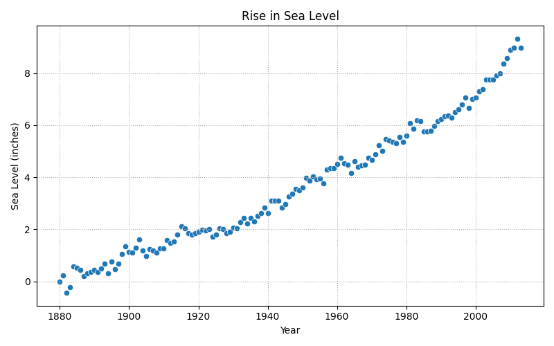
The scatter plot shows the adjusted sea-level measurements by year. A linear regression gives a compact summary of the overall direction in the observed data.
Fitting a trend
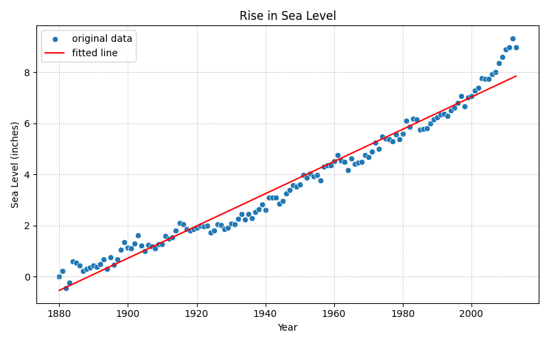
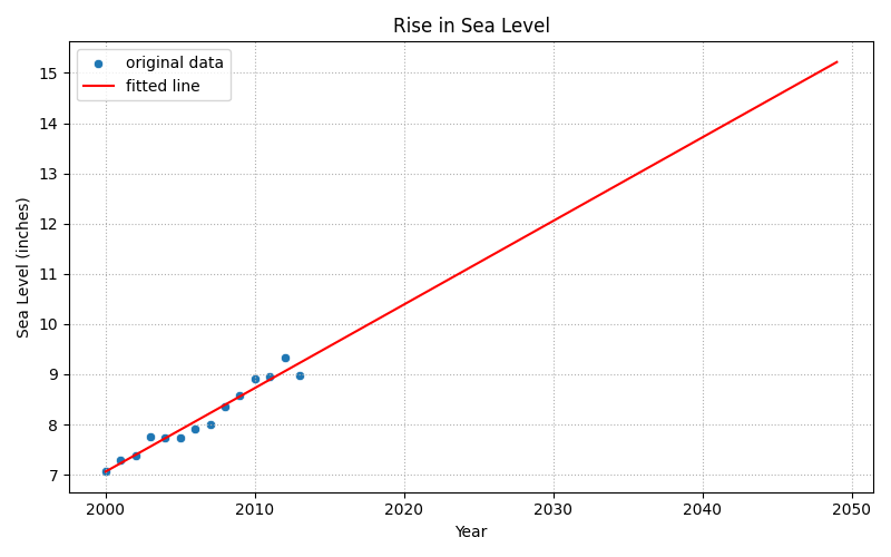
The next figure adds the regression line to the historical measurements.
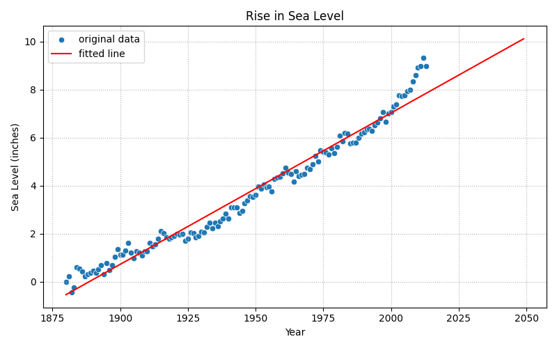
Extending a straight line beyond the observed measurements is an extrapolation. It shows what that simple fitted relationship implies; it is not a physical climate model or a reliable forecast on its own.
Looking at a recent period
Fitting a line to a recent subset gives a different view of the trend within that interval. The result depends on the selected start and end years, so it should be read alongside the full-record analysis.
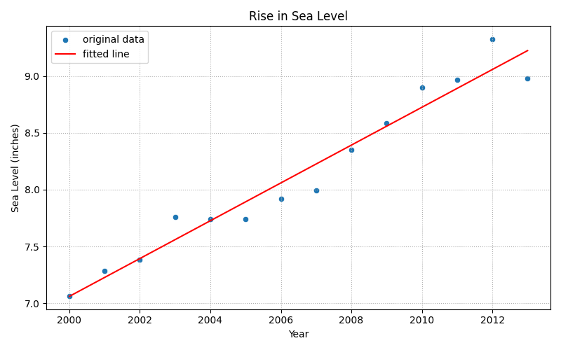
The final plot extends that recent-period line to the notebook’s selected endpoint. Like the overall projection, this is a simple linear extrapolation rather than a forecast.
Notebook
Open the exported notebook in HTML to see the code cells, calculations, and full outputs.